A Place for Connection

Alumni of prestigious universities like Yale have every reason to stay connected with the school that helped shape them: curiosity about classmates, ways to give back, the opportunity to tap into a powerful global network. But life gets in the way. An alumni site that fosters community and engagement must make it easy to connect and find the information you’re looking for.
The Challenge
The Alumni Association website had been failing in its primary responsibility to get visitors to the information they were seeking. Awkward navigation concealed important links to resources, interest groups, events and clubs. Finding a specific link — whether to a regional club or a volunteer opportunity — often required a long search and multiple clicks. Because the site could not convey the wealth of offerings available to alumni, it failed to inspire their participation.
Nor did the website clearly express the YAA identity. Surveys revealed overall confusion about its place in the broader Yale community. Charged with renewing the Yale experience over a lifetime, the Yale Alumni Association needed a dynamic online presence that would connect alumni in meaningful ways.

The Solution
Our goal was to enable visitors to seamlessly engage with the association and each other, whether they want to connect with a classmate, sign up for a tour, register for a reunion or volunteer at a service event. To get there, we had to refashion the structure of the site. We started with an analysis of the back-end design, created databases to allow members to better connect with relevant people and events, and mapped out a site structure to reveal and organize the breadth of YAA offerings. We created a platform for dozens of groups and clubs to facilitate direct connection between users. For example, an alum moving from Boston to San Francisco can now go to the site and easily connect with Bay Area alumni.


We reorganized content to follow a bite > snack > meal approach, offering avenues to entice and engage audiences at different levels of interest and commitment. Throughout this phase, we kept in mind that no alum in search of an event or offering should have to click too many times to find relevant information.
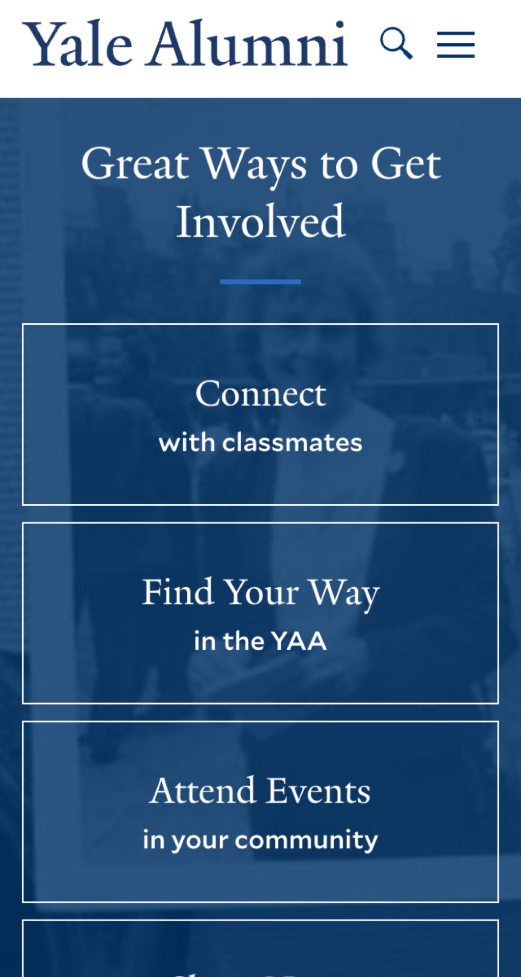
On the front end, we created a clear, consistent and intuitive user interface that responds to input and offers clear navigation pathways for multiple audience needs. The site now provides guidance to additional resources, streamlined access to tools and resources supporting higher engagement.
We balanced a clean, modern design with the ability to incorporate archival images of campus landmarks “then and now” that resonate with alumni and elicit a sense of nostalgia. We created a new tagline and integrated new branding and language that emphasized the association’s mission to bring alumni closer to each other and the university.
Cognizant of the YAA’s role in empowering alumni not just to participate but to co-create a diverse alumni experience, we gave groups the ability to create their own microsites. This feature is especially useful for the many reunions that different groups organize every year.
The Result
Visitors to the new YAA site are staying longer and viewing more. The Yale Alumni Association also reports increased site visitors, indicating that its members are engaging with a wider range of content and connections — beyond reunion information. More than a delivery agent, the new site inspires Yale alumni around the world to pursue the interests and activities that positively affect their lives, the Yale community and the world.