3 Universities, 1 System

Rutgers is a top-tier public university with more than 75,000 students, but in reality, it is three distinct universities: New Brunswick, Camden, and Newark. Each campus is culturally and structurally unique and has its own chancellor, communications and undergraduate admissions departments.
The Challenge
What’s more, each is made up of schools, programs, and offices, many of which have their own website, marketing department and IT team using unique technology and web hosting approaches.
Universities like Rutgers are famously democratic institutions. This spirit of democracy has drawbacks. It can undermine collaboration and encourage the pursuit of individual agendas at the expense of a unified strategy, which contributes to the complexity and costs the institution time and money while sacrificing marketing effectiveness. So Rutgers was an unlikely candidate to break out of this unproductive pattern and opt for a collaborative approach when three of its biggest operational units—the University-wide Rutgers Communication and Marketing, Rutgers University-New Brunswick and the system-wide Office of Research and Economic Development (ORED)—decided to pursue a unified redesign for all three websites. It was a gutsy, collaborative move that set the tone for a challenging project.


The Solution
Digital Pulp offered Rutgers an opportunity to take this strategy one step further. We proposed a global system that would work not only for these three different units, but also for the future needs of all entities under the Rutgers name.
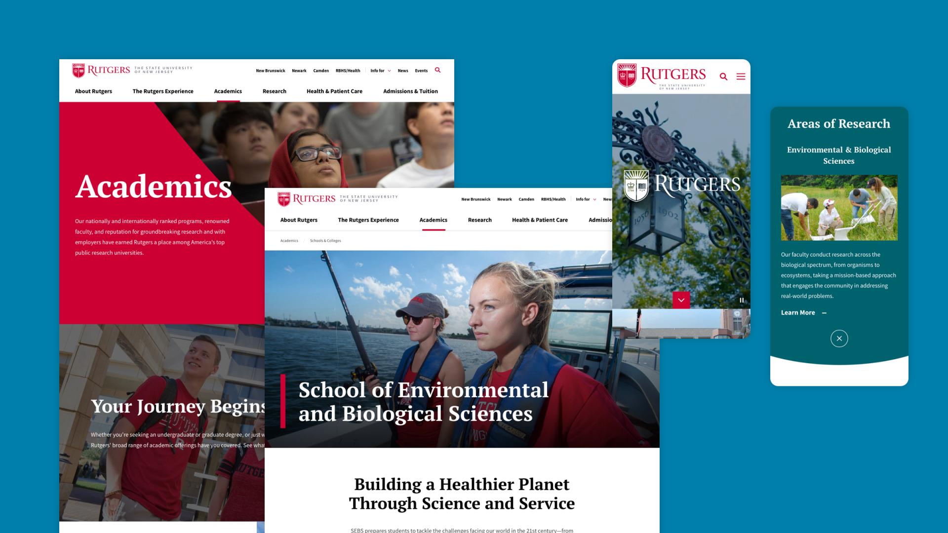
Our solution hinged on creating a single component library of modular pieces that could be mixed and matched like Lego blocks. Through rounds of collaborative conceptualization and revision between DP and Rutgers stakeholders, we designed components that meet each group’s needs and communications vision.


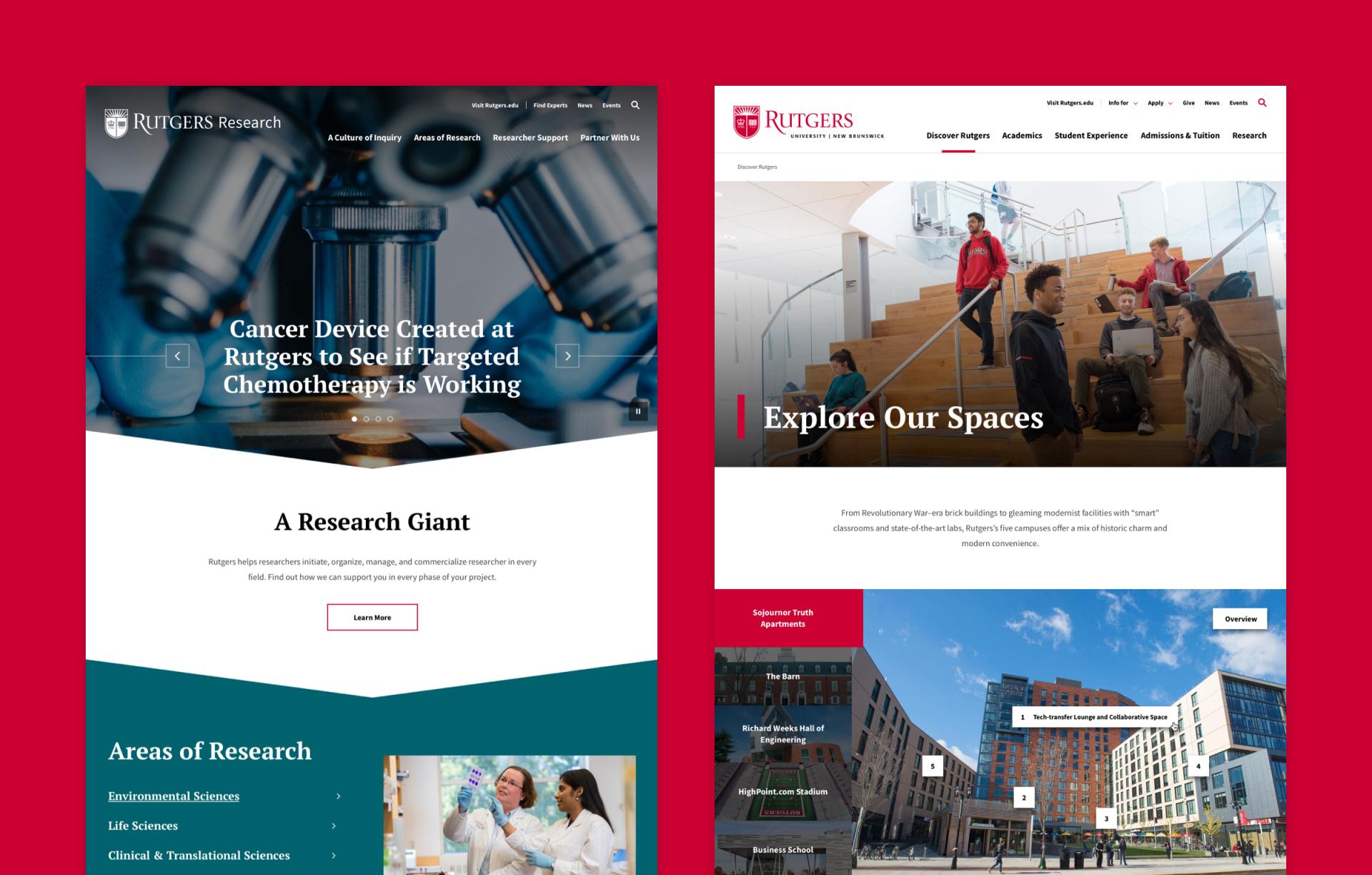
We knew each site would need its own small set of custom components— navigation headers, footers and homepage elements—to showcase their identity. Even these distinct features leveraged our consistent conventions for navigation and overall user experience.
With this shared resource of website elements, web editors at Rutgers now use a common set of components—slideshows, videos, photos, news blocks—but with the freedom to arrange assets and use branding elements according to their own unique needs. The component library assets can be arranged in countless ways, not only for these three websites, but to support the creation of future sites for other Rutgers schools, programs, centers, institutes, offices. Using the shared components, web editors can create beautiful sites that align with the Rutgers brand.
The Result
From concept to launch, Rutgers and Digital Pulp stewarded together this ambitious idea of a shared library of recombinable website components to stakeholders and communicators throughout the institution.
The three sites we created for Rutgers? They aren’t twins, they’re sisters. Rutgers.edu, newbrunswick.rutgers.edu, and research.rutgers.edu are now live. Together they are unique, functional sister sites with common underlying technology and global design elements. Everything can be shared and moved around to create a more consistent user experience, but not at the expense of discrete organizational identities. It was a holistic approach to develop a modern, efficient and unified system of sites while saving Rutgers money and time.

What’s next? After three successful site launches, Rutgers is beginning to roll out the component library to other departments and groups at the university. This will enable various other partners to spin up new websites quickly and efficiently, leveraging the uniform design and approach of the component library as a sturdy foundation.
Awards and Acclaim