A Refreshed Brand for a Historic HBCU

Miles College, a small HBCU in Birmingham, Alabama with just under 1500 students, has a great story, one that inspires students and makes its faculty and alumni proud. But when we began to work with Miles in 2020, the school was flying under the radar because that story was largely unknown. We set out to change that.
Digital Pulp provided excellent guidance for us as we repositioned our college’s brand for the 21st century.
The Challenge
Miles hired the team at Digital Pulp to redesign the school’s website, which was over six years old and in dire need of an update. The messaging fell far short of supporting the school’s values of empowerment, pursuit of justice, and community. The site’s content was focused on current students and faculty, and was completely underleveraged as a marketing tool to engage external audiences, especially prospective applicants.
The admissions team at Miles keenly felt the need for improvements, but with a small team and limited resources, it required an agency partner who understood its challenges, shared its mission, and could think strategically about an ideal solution. At the time, we were working with two other HBCUs and we were closely aware of the renewed interest in these institutions thanks to recent events, from the positive (MacKenzie Scott’s $150 million philanthropic gift in 2021) to the tragic (the death of George Floyd in 2020) to the seismic (the Black Lives Matter movement that had been steadily growing gaining momentum since 2013). While the increased attention helped to raise the profile off all HBCUs, including Miles College, Miles also found itself working harder to position itself against schools like Howard University and Spelman College with higher national profiles.

Laying the Groundwork
To start, we conducted dozens of stakeholder interviews. Whether we were speaking to faculty, students, or alumni, they consistently expressed a high level of commitment to the school and cited the school’s place in civil rights history as significant to them. In segregated Birmingham of the 1960s, Miles College students played a central role in organizing boycotts that then set the stage for Martin Luther King’s historic Freedom Summer. And in 2021, the Miles Student Government Association created the first Black Lives Matter street mural at an HBCU.
The story of Miles College is a story that deserves to be told. Compelling content would be essential to reach the audiences that would shape the college’s future.
But something even more important was missing—a strong, differentiated brand identity for Miles College.


A New Brand Identity
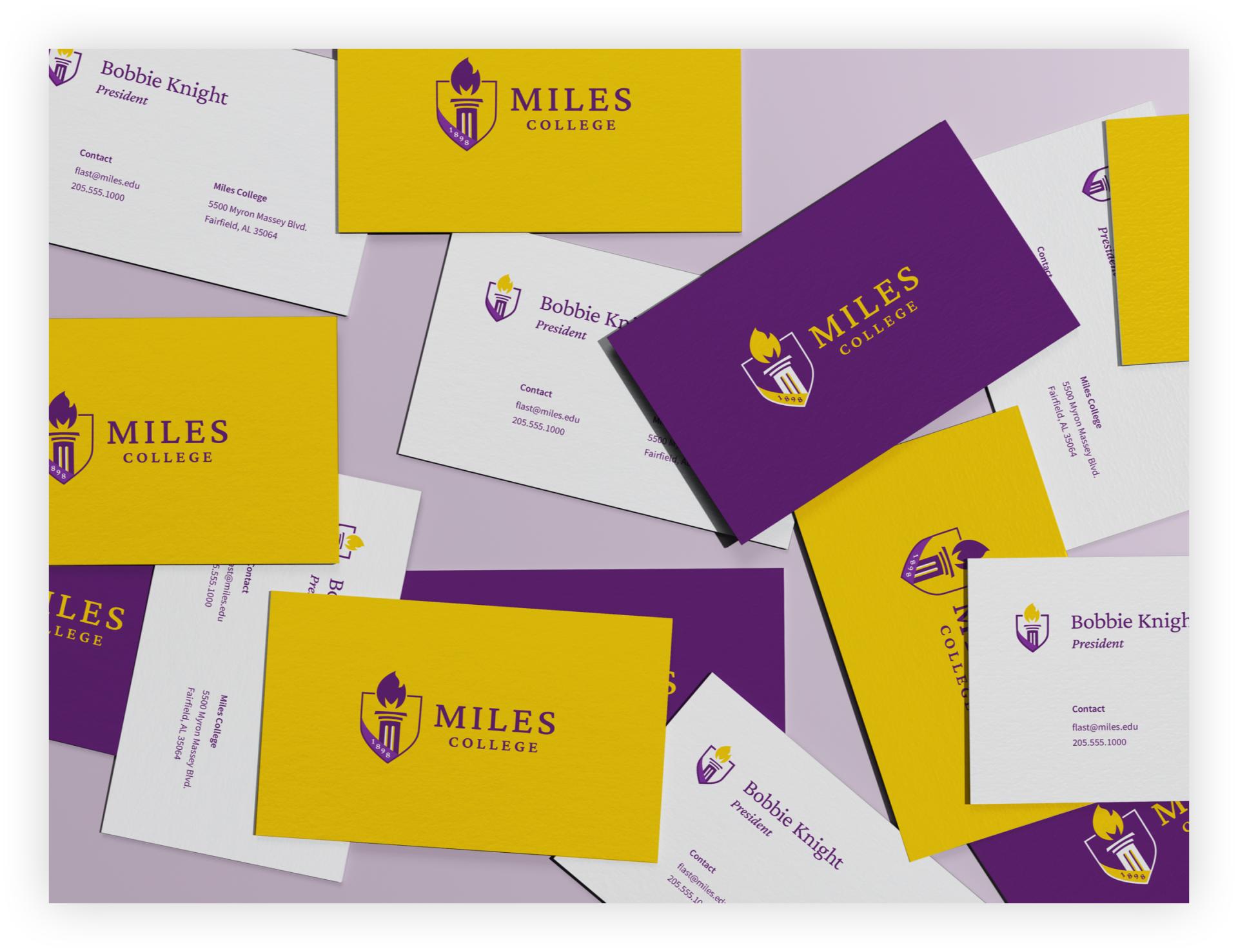
The team at Miles asked us to expand the scope and create a new logo and visual identity to tell the school’s unique story and differentiate it in the minds of prospective students.
The logo is a representation of Miles College as both a place and as a community. The column refers to the physical campus and the flame serves as a metaphor for the fires of both intellect and passion. In short, it’s a symbol for igniting change.
Along with the new logo, we updated the brand colors to work better across all media and developed a visual system using the image of the flame, which can literally surround subjects to emphasize their connection to Miles. We introduced a light dot-grid texture to the visual brand identity, inspired by the frequently-observed halftones in historical imagery tied to the school’s Civil Rights activism, but modernized for today’s high-res world.
We also provided guidance on the creation of a new photo library that reflects the beauty of the campus and the authentic energy of the students and faculty.
A Website That Speaks for Future Generations
Colleges and universities can have many masters to please when redesigning the institution’s website. The result tends to be a large, comprehensive, and exhaustive library of information. But the larger a site, the more resources are required to maintain it, and Miles College didn’t have that luxury.
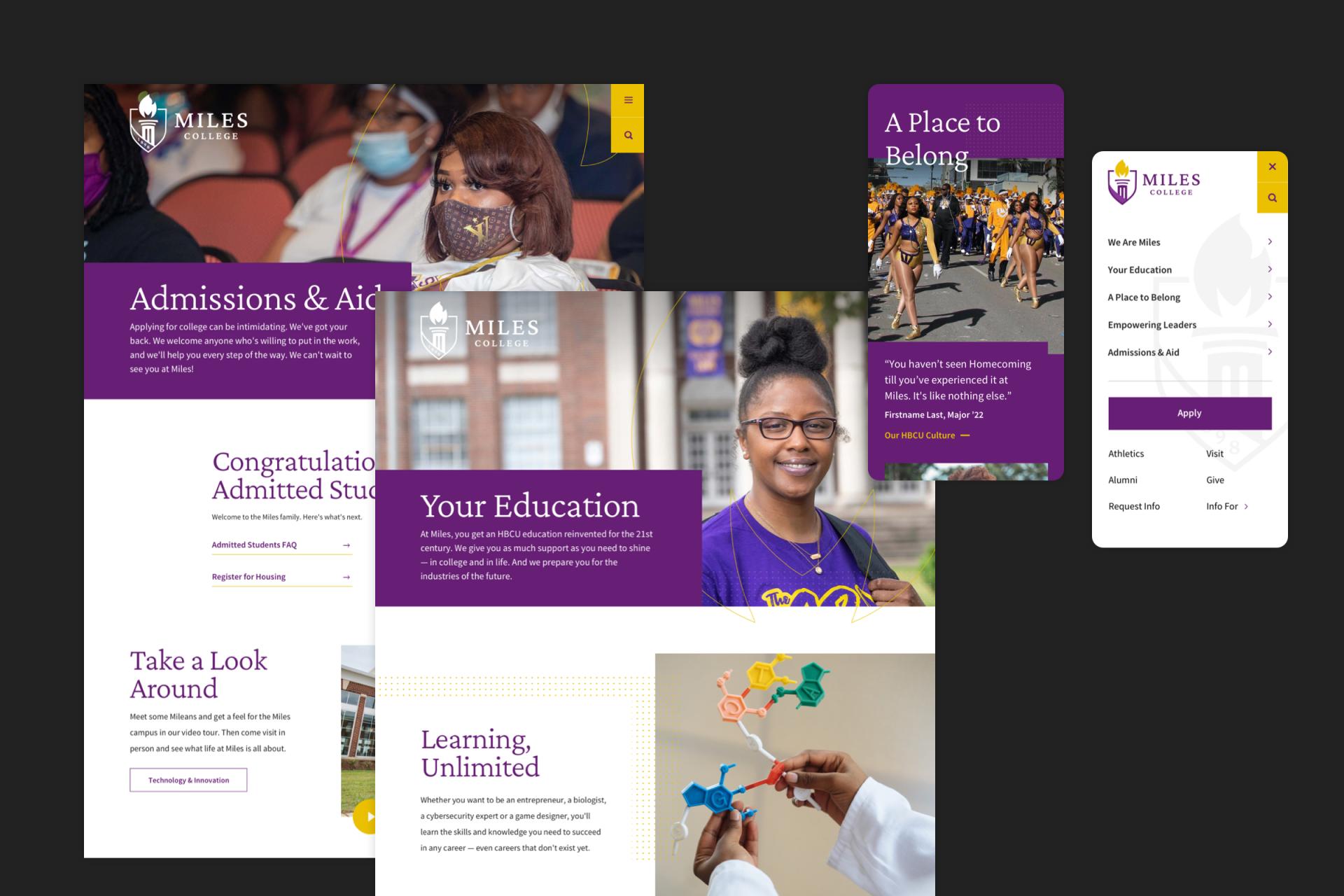
We proposed the idea of a smaller, highly functional site design highlighting core content its audience was seeking. The streamlined site map eliminated most lower-level pages and focused on telling the school’s story, painting a picture of academic and student life offerings, and rethinking the admissions experience.
The Admissions section was designed to be easy and accessible for first generation students who need basic information that other colleges may take for granted. For instance, the site links directly to financialaid.gov where students can find step-by-step video instruction on how to apply for federal aid.
We also provided the internal team at Miles with reinforcement around content development. Because its site was geared primarily to current students and staff, Miles College had little information for prospective students, so we created content from scratch, drawing on the discovery interviews with students, faculty and alums.


The Result
The team at Miles College now has a brand identity to support it in its mission and a digital home base where it can welcome its students.
Beyond a website, Miles’s internal marketing team now has a suite of content management tools it can use to continue to tell its inspirational story. We also provided a content development guide to help the school plan resource allocation and timelines for creating different types of content.