-

-
Services
Web Design & Development -
Industry
Consumer -
Visit
-

-
Services
Web Design & Development -
Industry
Consumer -
Visit
Where luxury meets usability.
The Challenge
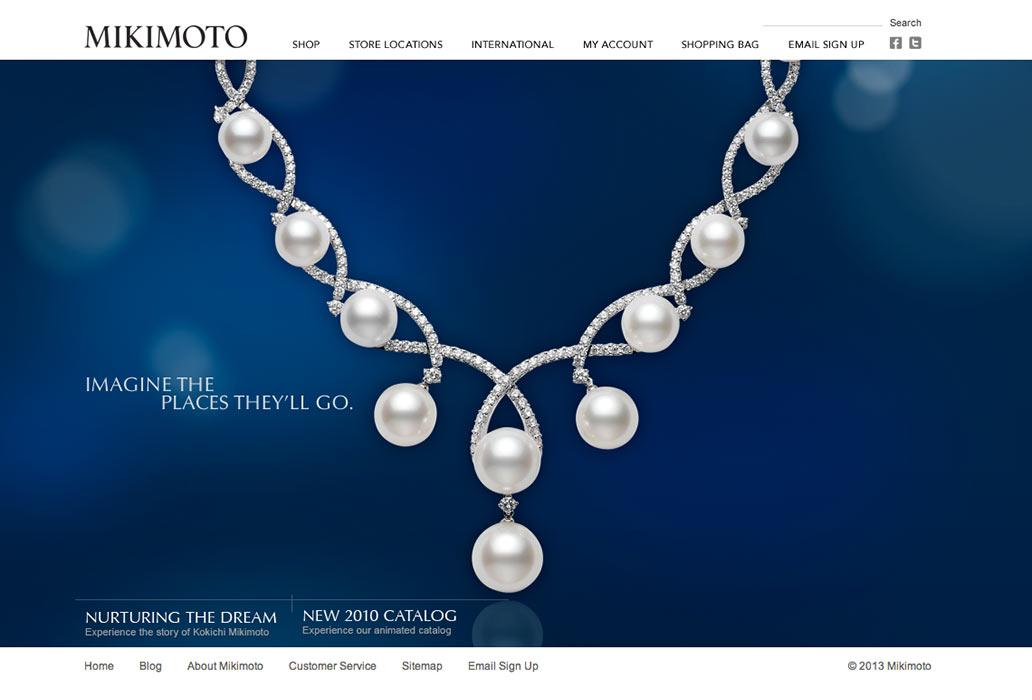
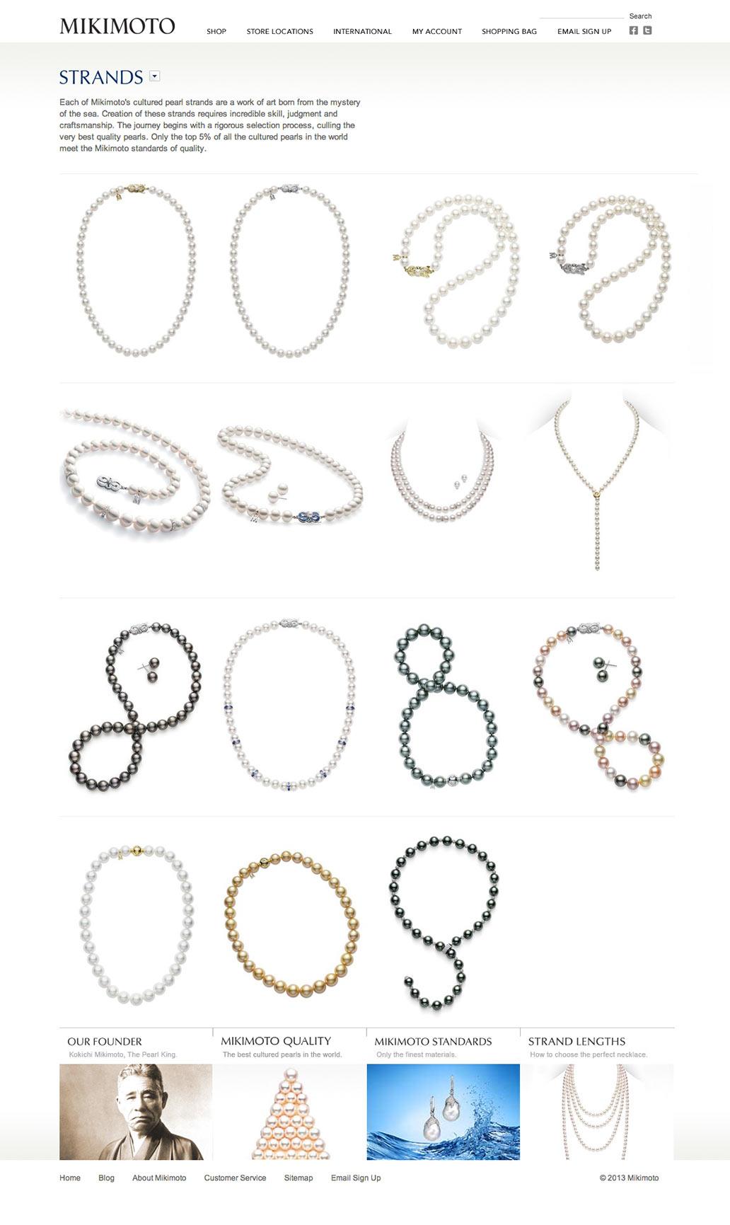
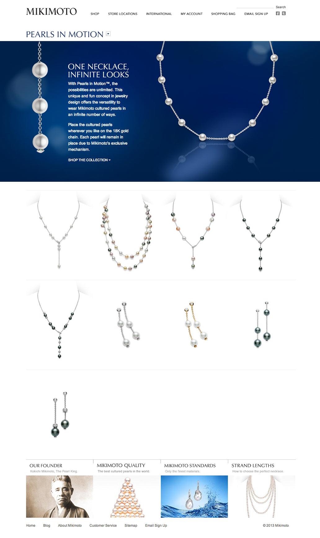
The Mikimoto America website had not been redesigned since 2004 and offered a poor experience to online shoppers. It did little to showcase the jewelry brand or its high quality, and was difficult for site administrators to maintain. The new site had to adhere to strict brand guidelines, guided by headquarters in Japan, yet tap the modern aesthetic of today’s affluent shopper.
The Solution
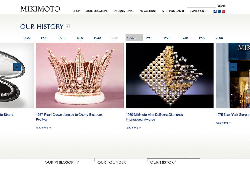
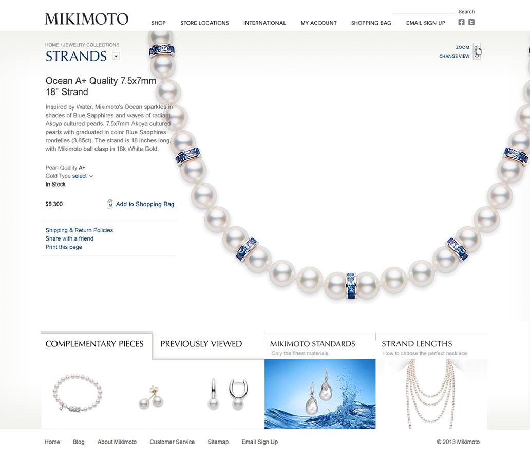
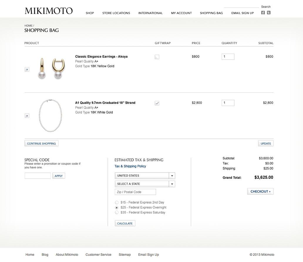
The site is designed around the romance of the brand, featuring stunning, hi-res images of the product in an innovative and luxurious shopping environment. The new destination balances brand content and product, offering intriguing glimpses into the company’s rich heritage and allowing customers to examine fine details of a strand of Akoya pearls as if they were admiring them in a display case at the Fifth Avenue store. A powerful, state-of-the-art content management system supports the site, providing improved flexibility and ease-of-maintenance for site administrators.
The Result
The new Mikimoto America website re-energized the brand and positioned the company strongly to take on extremely competitive luxury goods marketplace.
