Unity and Autonomy: Bringing Order to Local Chapters

Make-A-Wish America is known and loved for its work fulfilling the wishes of critically ill children. Nearly 40 years after granting its first life-changing wish in 1981, this charitable organization had grown to 60 independent local chapters operating under an updated Make-A-Wish brand umbrella. But the nonprofit’s slew of chapter websites had not kept pace with the brand.
The Challenge
The underlying technology was out of date, and the sites suffered from a cluttered content architecture. This compromised two crucial local functions: raising money and matching volunteers with kids. Chapter leaders also had urgent needs: They wanted to embrace the exciting new brand design but still customize for their specific regional audiences.
At the same time, new national leadership was committed to propagating the updated Make-A-Wish brand and messaging, and reengaging local audiences with the brand’s promise of uplifting the lives of children and families coping with unimaginable burdens.

The Solution
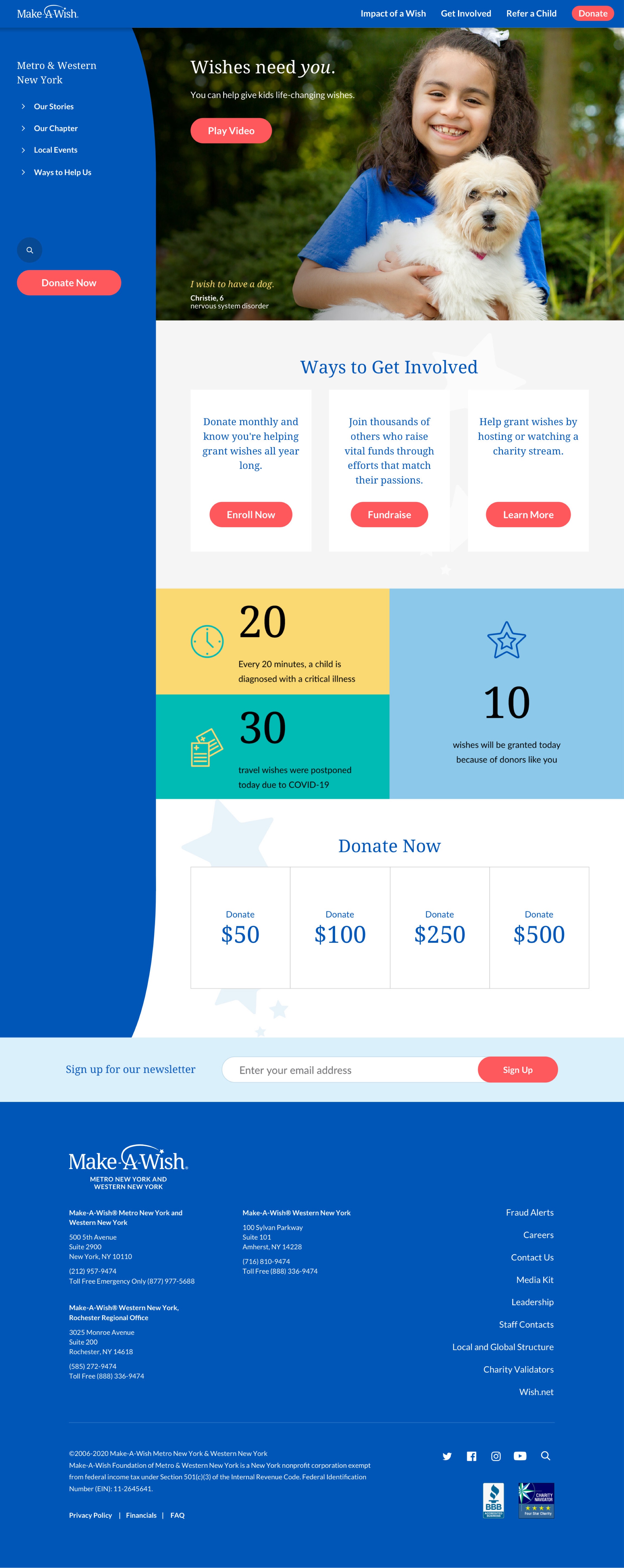
We wanted to give visitors a more seamless experience and create a consistent brand approach across the Make-A-Wish ecosystem, so we integrated the 60 chapters on a single platform and made them all accessible individually through the national site by inputting location. The new platform would be easier to manage and consistently branded, while still maintaining the experience of dedicated local chapter sites.
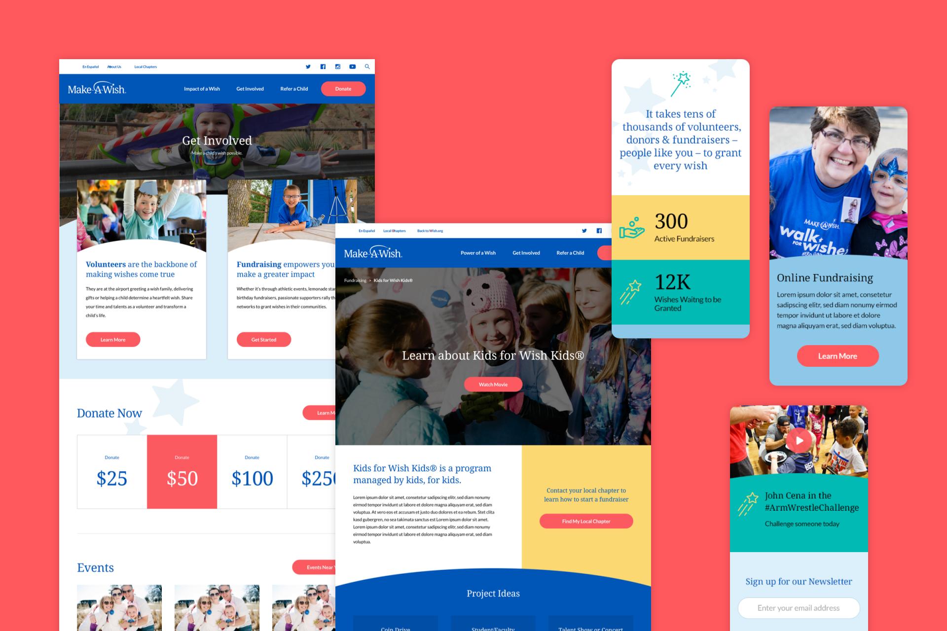
We knew from the data that when a potential volunteer or donor visits a chapter, they’re highly motivated to take action. Instead of leading with calls to action for next steps, local sites greeted users withlengthy stories about Make-A-Wish’s impact. We redesigned the site architecture to present minimal barriers to action. Donation buttons and links to the chapter network are prominent on the homepage. While inspiring stories about children and their wishes are still key features, they’re there to encourage action, not distract from it. Besides making the site architecture more user-focused, we simplified it, reduced the clutter and created modules that dynamically populate with hyperlocal messaging. And we developed detailed guidelines so chapter staff could develop content that aligns with the flagship site’s messaging.
This data-driven design, informed by historical analytics and A/B testing, clarified the path to conversion with more intuitive navigation and compelling entry points.


The Result
The new wish.org site chapter platform presents a cohesive brand and mission. It’s designed to encourage action while still connecting emotionally with audiences. By streamlining the relationship between the flagship and chapter sites, we created a more integrated messaging flow while also streamlining the donation process. Fresh, modern and relevant to the organization’s structure and mission, the new site rebooted a venerable brand and immediately began to deliver elevated engagement and conversion.
Awards and Acclaim
Digital Pulp provided tremendous insight and value as our strategic partner in the redesign of 60+ national and local chapter websites. They understand content strategy for the web better than anyone we’ve worked with, and this has led to statistically significant increases in revenue per visitor, conversion rate, and engagement.