-

-
Services
Web Design & Development -
Industry
Publishing -
Visit
-

-
Services
Web Design & Development -
Industry
Publishing -
Visit
Engineers are users too.
The Challenge
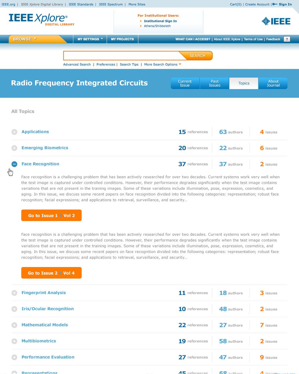
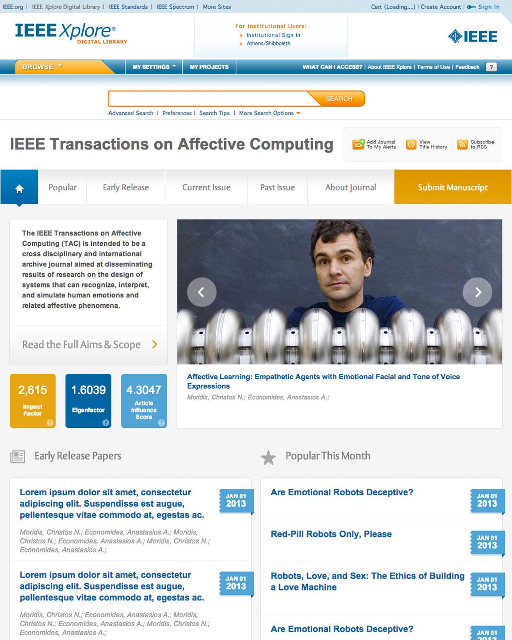
While the content was unrivaled, the IEEE's website presentation and user experience was lacking. Users needed a more intuitive interface to find and explore the content.
The Solution
Engineers have come to expect challenging, complex, and blunt interfaces, so this was our chance to change that perception. By leveraging modern interface technologies (and avoiding Flash) we were able to deliver a truly exceptional user experience. Tabs reveal content in layers, and page markers follow as users scroll down long pages. The experience has been transformed from laborious to inspired while retaining the necessary sophistication and level of detail that the engineering community demands.
The Result
We’ve completed a number of projects for IEEE over the years, but the Xplore project was one of the most unique—and one of the most challenging. Our process involved extensive amounts of user research that included surveys and direct interviews. It yielded a site that, while focused on complex engineering content, delivered a user experience that most engineers would never have expected. The feedback from IEEE’s members has been overwhelmingly positive since launch, and we continue to work with the IEEE team to further optimize the experience.


