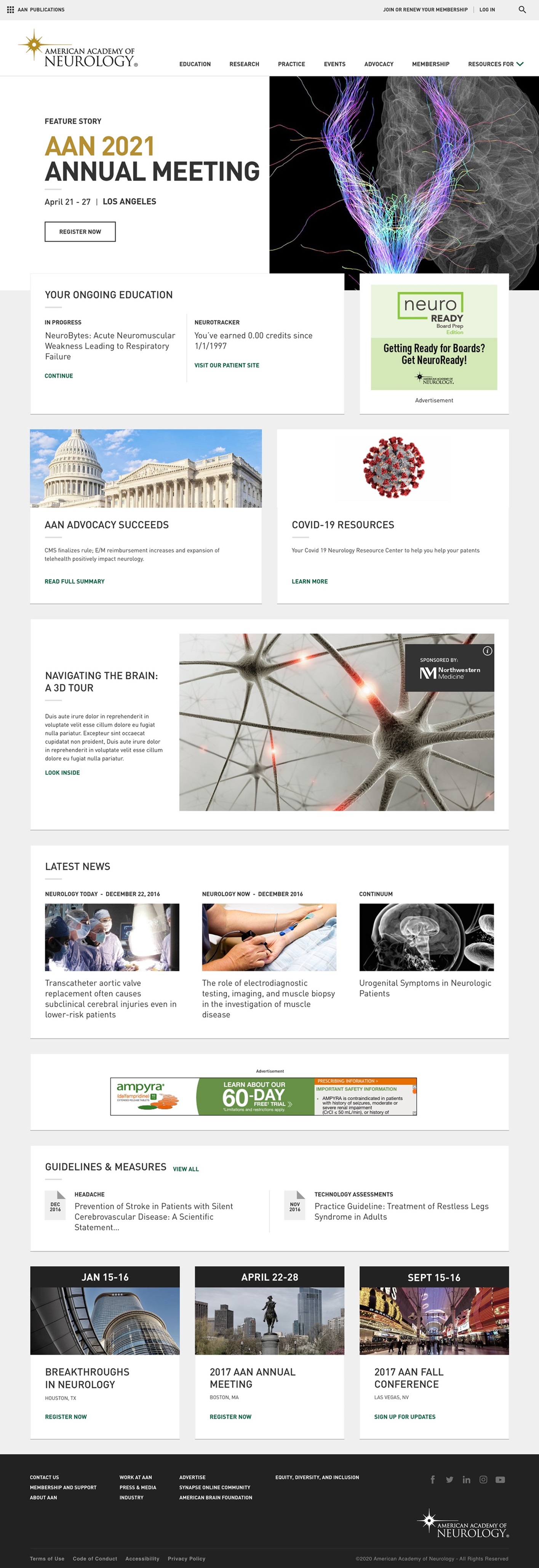
A Smart Site for Brain Experts

A personalization strategy based on well designed personas helped us transform a site that failed to engage users into a destination for easily exploring all that this multi-pronged association has to offer.
The Challenge
Professional organization websites present a unique challenge for their diverse groups of users because of the wealth and breadth of information and services they provide, often across a variety of specialized microsites and distinct URLs. It was no different with the American Academy of Neurology, who approached Digital Pulp for a complete website reimaging and redesign. For this effort, a fresh, modern look was desired, but with the expectation that any new design would be underpinned by intelligent information architecture and data-driven personalization to be considered a success.

The Solution
Digital Pulp began with a detailed discovery process to analyze the various audiences likely to visit AAN.com. Understanding the key goals of these diverse groups would present a clear path for the essential navigation structure. It also would allow us to create intuitive pathways for repeat users, such as association members, guiding them toward specific features like professional conference registration and access to publications and the member directory.
The previous AAN.org was fragmented and task-oriented and, as a result, users were inclined to visit only to perform one or two specific tasks, often leaving without seeing the variety of other services and capabilities the website had to offer. DP’s site strategy was an ambitious personalization program that provided AAN with a matrix of discrete personas and an implementation guide for the content development team, ensuring that a unique website experience could be offered to site users from diverse professional backgrounds.
This means that a researcher, once identified, will see content more specific to their own needs, promoted above website pages intended for nurses or support staff. This personalization was achieved through over 20 flexible templates that display different layouts, notifications, and content recommendations throughout the site, based on user behavior. These templates were created in CMS-agnostic front-end code that allowed AAN’s internal technology team to easily integrate with their own back-end infrastructure, while providing valuable flexibility to future feature development efforts.
Finally, a powerful, suggestive site search engine that crosses multiple AAN domains was implemented, ensuring that users were unlikely to miss relevant content, while collecting data from search behavior to continually improve the experience for future users.

The Result
The new, optimized AAN.com architecture ensures that casual visitors can easily find the information they’re seeking from a simplified navigation, while power-users are driven through utility navigation and personalized site content pathways that engender discovery of other organization services such as advocacy, membership documentation and guidelines, and career assistance. Post-launch feedback from the Academy shows that the redesign has improved user experience dramatically now that users can access the information most relevant to them quickly and easily.
Awards and Acclaim
2018 Communicator Awards - Award of Excellence
2018 Digital Health Awards - Merit